Every room has a personality. Sometimes it’s obvious. A red dining room that says “sit down, we’re having wine.” A pale blue bedroom that whispers “take a nap.” Other times the room just sits there, beige and quiet, not saying much of anything.
Color and pattern are how you give a room something to say. And the good news is you don’t need a degree in color theory to pull it off. You just need a starting point and a little courage.
Start With One Color You Actually Love
I’m not talking about the color you think you should like. Not the one your neighbor used. Not the one that was trending on Pinterest last year. I mean the color that makes you feel something when you look at it.
Maybe it’s a deep navy blue. Maybe it’s a warm terracotta. Maybe it’s the exact green of a sage leaf you noticed on a hike last fall. That’s your anchor color. Everything else in the room will either support it, contrast it, or get out of its way.
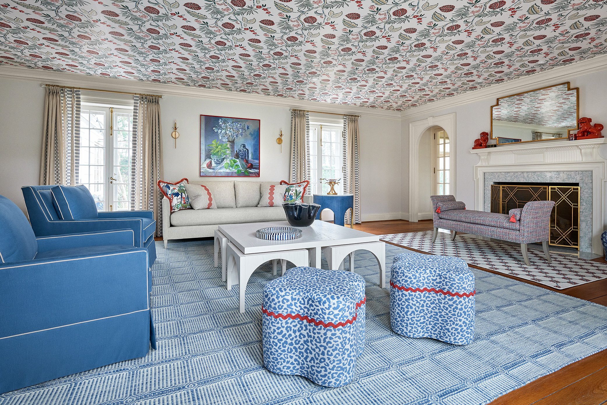
In this project, a homeowner had a living room full of beige furniture and white walls. She kept saying she wanted it to feel “more interesting.” Her favorite color? Red. Not a timid blush. Red. The Decorating Den designer wallpapered the ceiling in a bold floral, added blue and white upholstery, and let pops of red carry through the pillows and accessories. The room went from background noise to the most talked-about space in the house.
Patterns Are Not Just for Throw Pillows
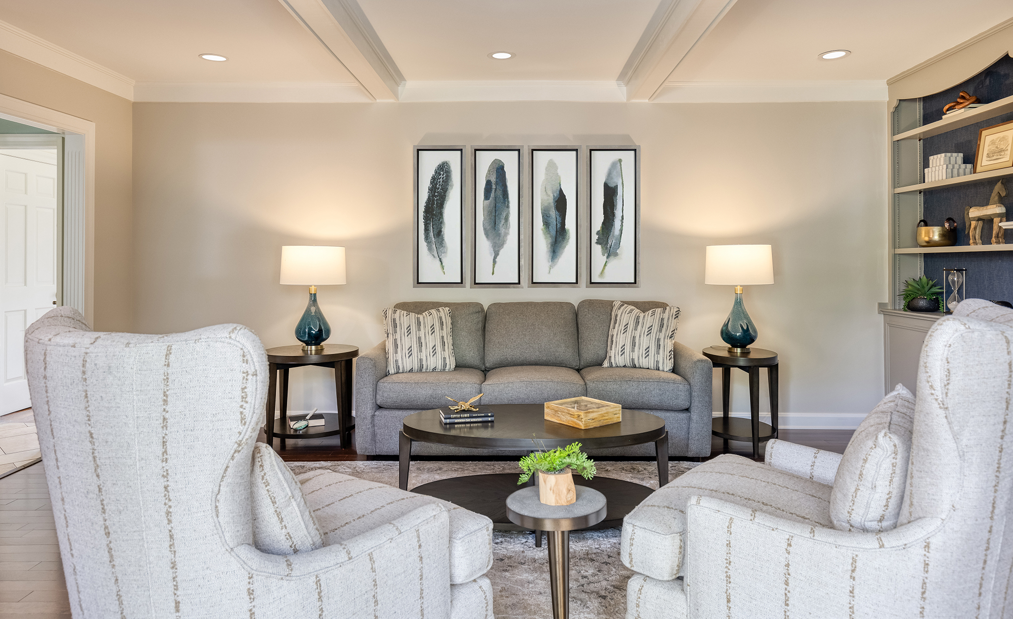
Here’s a mistake I see constantly: someone picks a beautiful color palette and then plays it safe with solids everywhere. One lonely patterned pillow on the couch, and that’s it.
Patterns are how a room gets depth. They’re the difference between “nice” and “I can’t stop looking around.” But mixing patterns scares people. It shouldn’t.
The trick is scale. You want one large-scale pattern (a floral drape, a bold area rug, an upholstered chair), one medium-scale pattern (a geometric pillow, a striped ottoman), and one small-scale pattern (a textured throw, a subtle print on a lampshade). As long as they share at least one or two colors in common, they’ll play nicely together.
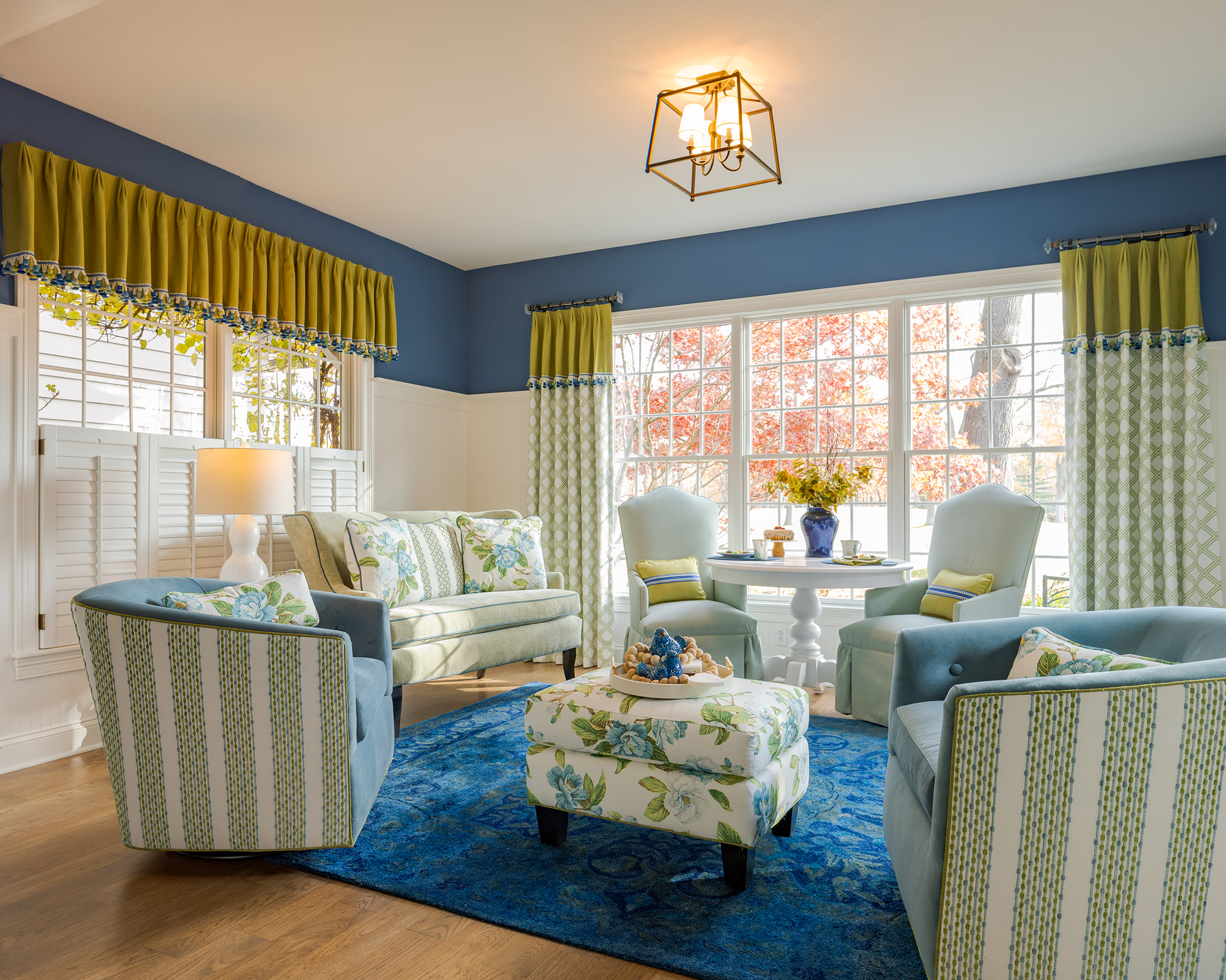
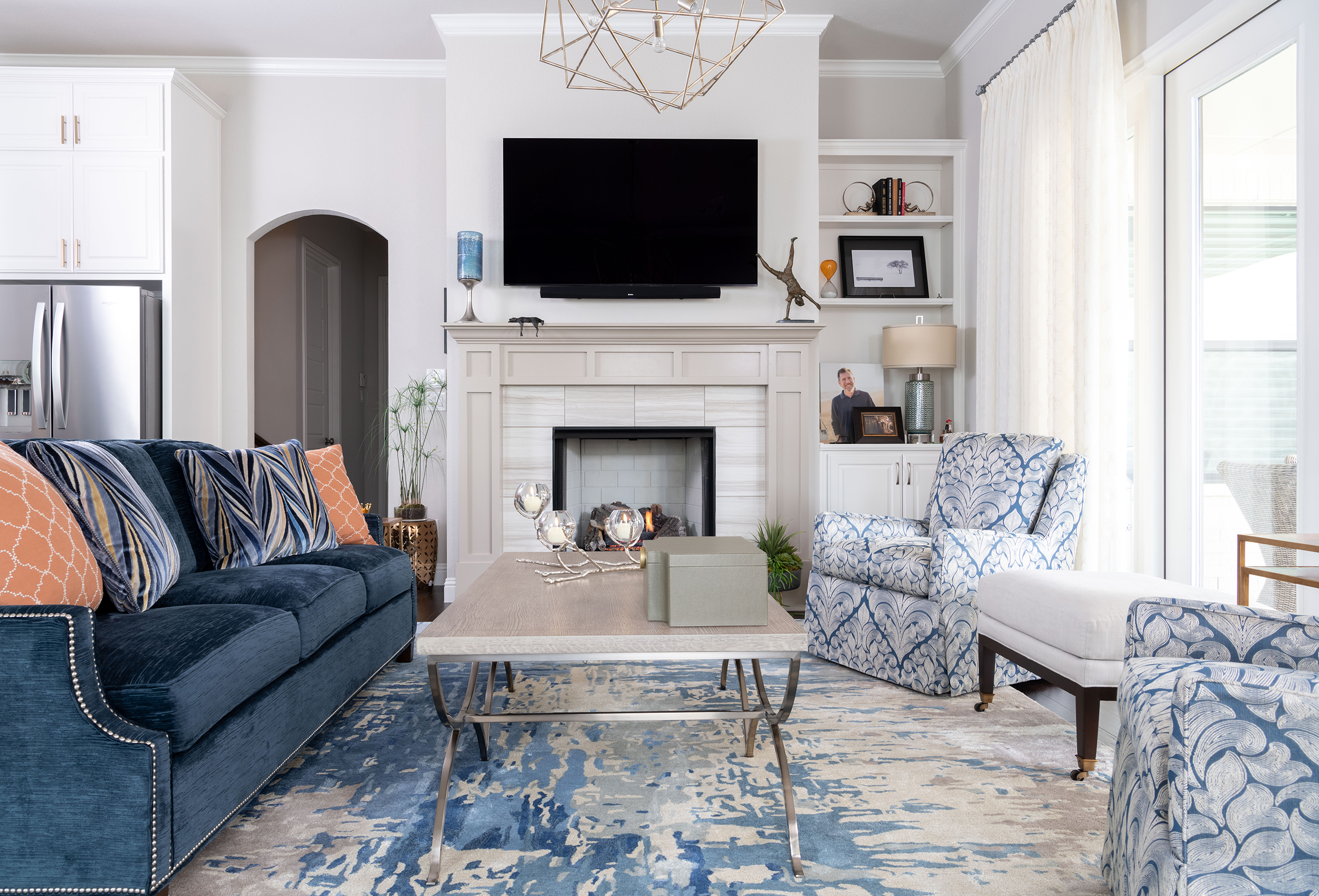
This cheerful family room is a great example. The designer started with a cobalt blue area rug as the anchor, added chartreuse valances with a geometric print, and pulled in a floral ottoman that tied the two colors together. Three different patterns, all working because they share a common thread. It’s the kind of room that makes you smile when you walk in. That’s the goal.
Neutrals Need a Job Too
I’m not anti-neutral. I use neutrals in every project. But a neutral should earn its spot, not just fill space because you couldn’t decide on a color.
The most interesting neutral rooms layer texture and tone. An olive accent wall behind the bed. Linen bedding in cream. A weathered wood art piece. Geometric patterns in the pillows that add movement without screaming for attention.
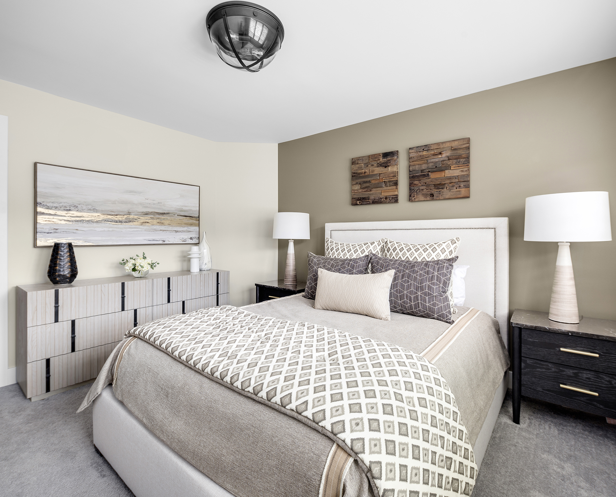
When you go neutral, you have to work harder on texture. A flat beige room with smooth surfaces is a waiting room. A layered neutral room with linen, wood, wool, and stone is a sanctuary. Same color family, completely different feeling.
Texture Is the Secret Third Layer
Color gets you in the door. Pattern keeps you looking. Texture is what makes you want to sit down and stay.
A velvet sofa next to a jute rug. A glossy ceramic lamp on a matte wood nightstand. A chunky knit throw over smooth leather. These contrasts are what give a room that “I don’t know why, but this just feels good” quality.
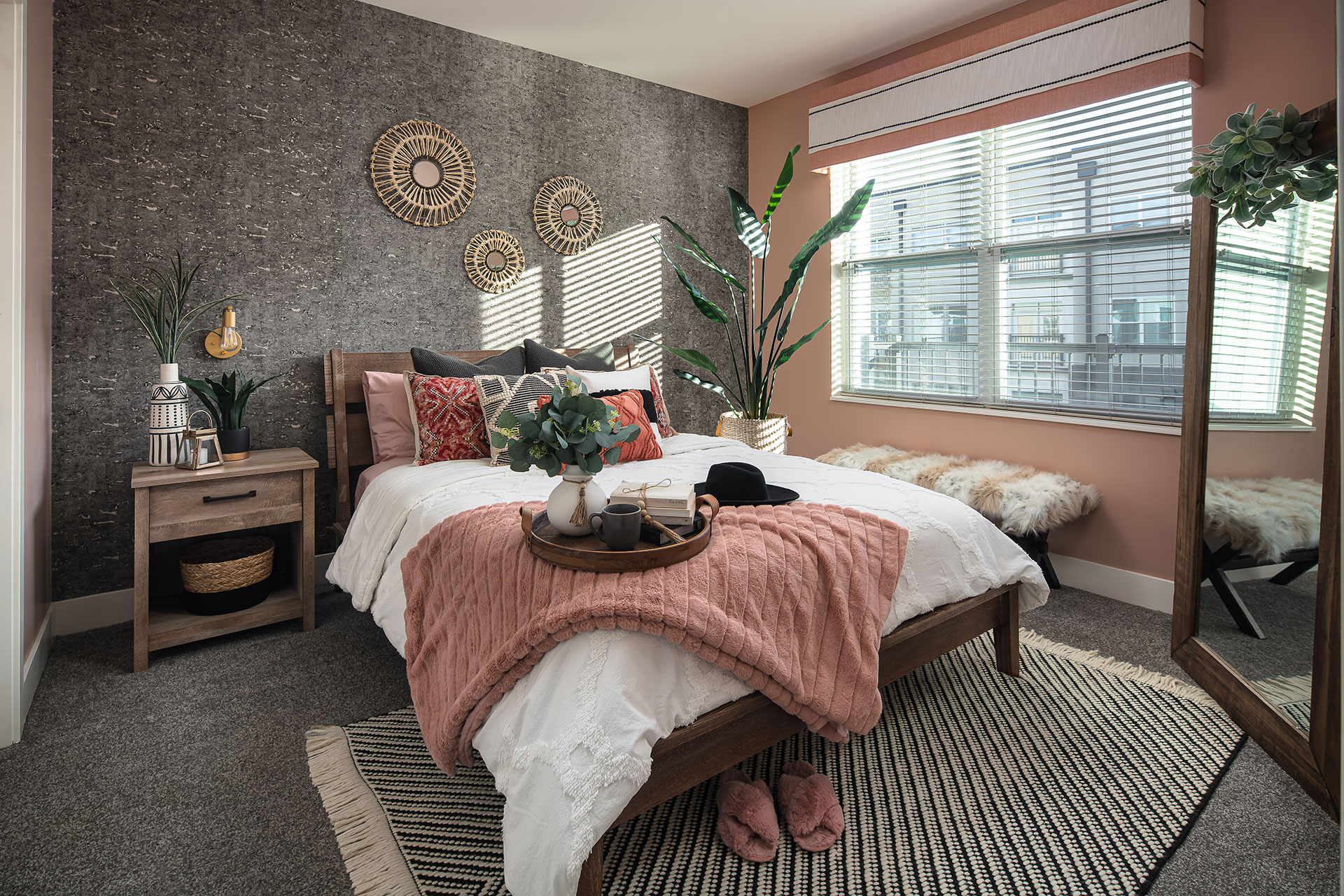
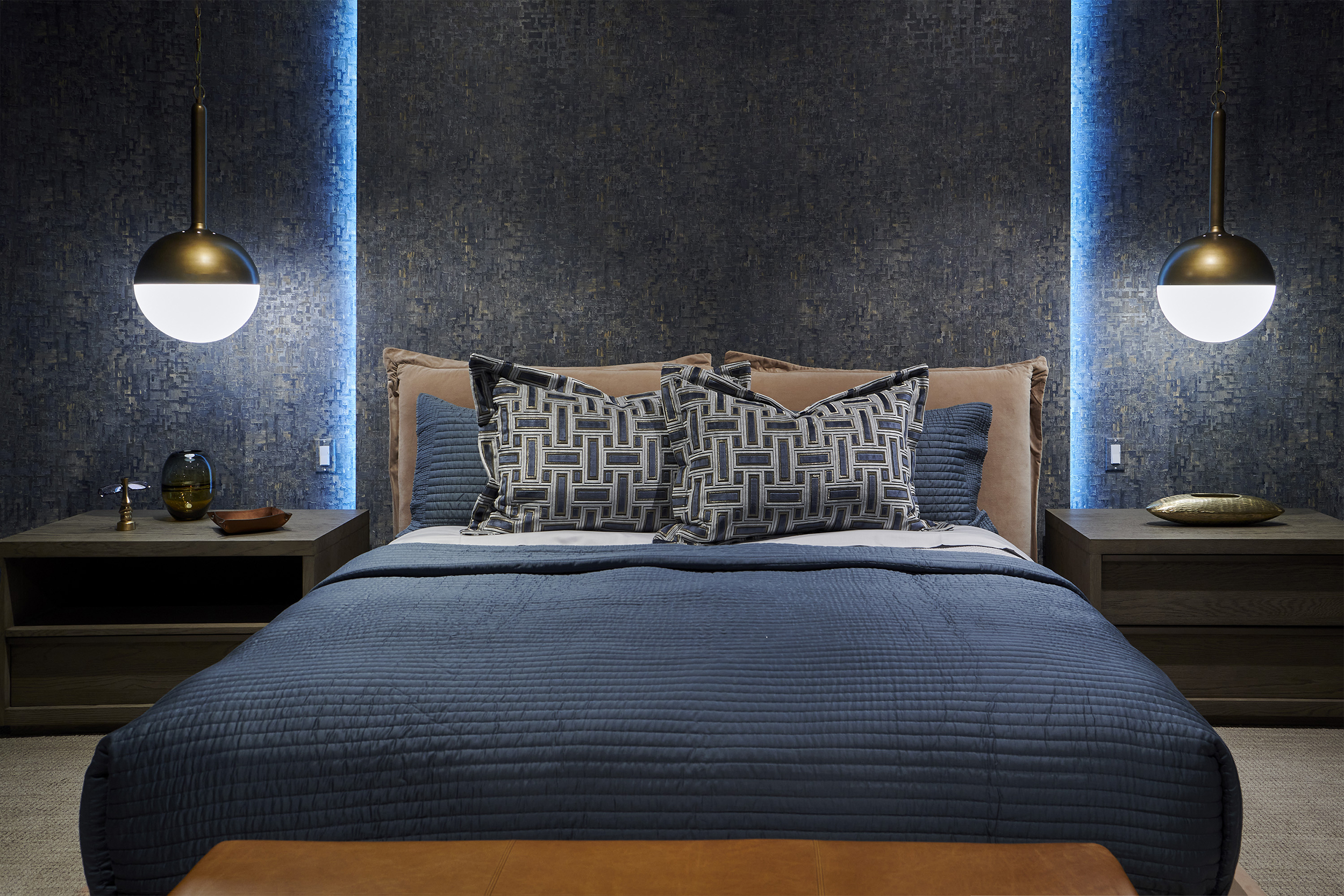
This bedroom is one of my favorite examples of texture doing the heavy lifting. The designer used a cork accent wall (yes, cork), paired it with a dusty rose throw, woven baskets on the wall, and live greenery throughout. The color palette is barely there. Three soft earth tones. But the texture makes it feel like wrapping yourself in a blanket.
Lighting Changes Everything You Just Picked
This is the part nobody thinks about until it’s too late. You pick a gorgeous blue for the dining room, paint it, and then at 7pm under your overhead light it looks gray. Or green. Or sad.
Colors shift dramatically depending on light. Natural daylight shows you the truest version. Warm bulbs push everything toward yellow and amber. Cool LEDs can make warm tones look washed out.
Before you commit to a color, test it. Paint a large swatch and look at it at 8am, noon, and 8pm. Look at your fabric samples under the actual lighting in the room where they’ll live. This five-minute step saves more regrets than anything else I recommend.
Your Room, Your Rules
There’s no formula that guarantees a beautiful room. The best spaces have one thing in common: they look like the people who live in them. Not like a catalog. Not like a Pinterest board. Like real life, with all its weird little preferences and sentimental objects and that one chair everyone fights over.
Color and pattern are your tools. Texture is your secret weapon. And the only rule that actually matters is that you should love walking into the room.
If you’re staring at your walls right now thinking “something needs to change,” trust that instinct. Let’s talk about what your rooms could say about you. I’ll bring the ideas. You bring the courage.